We gave Ayye a brand that proves itself.
Ayye had the app. It did not have a brand. So we took what they were already using, systematized it, redrew the mark, and built a system clean enough to ship today and loose enough to grow into.
5 colors. 40 tones. 1 sans.
One mark. Redrawn in General Sans to do every job.
Five primary. Forty tones. One gradient.
Dominance, enforced.
Cream and black do the work. Amber is punctuation, not paint. If something looks amber-branded, pull it back.
The Receipt gradient
One sans.
All the volume.
Receipts hit different.
Weight does the work. One face, drawn with enough personality to carry the wordmark, the display, the body, and the UI. The attitude comes from scale and tracking, not a second font.
One system,
split into two ad sets.
Same four templates, retargeted voice. The Creators set talks to the talent. The Early Adopters set talks to the founders racing for founding pricing.
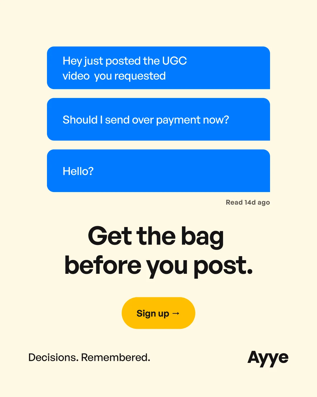
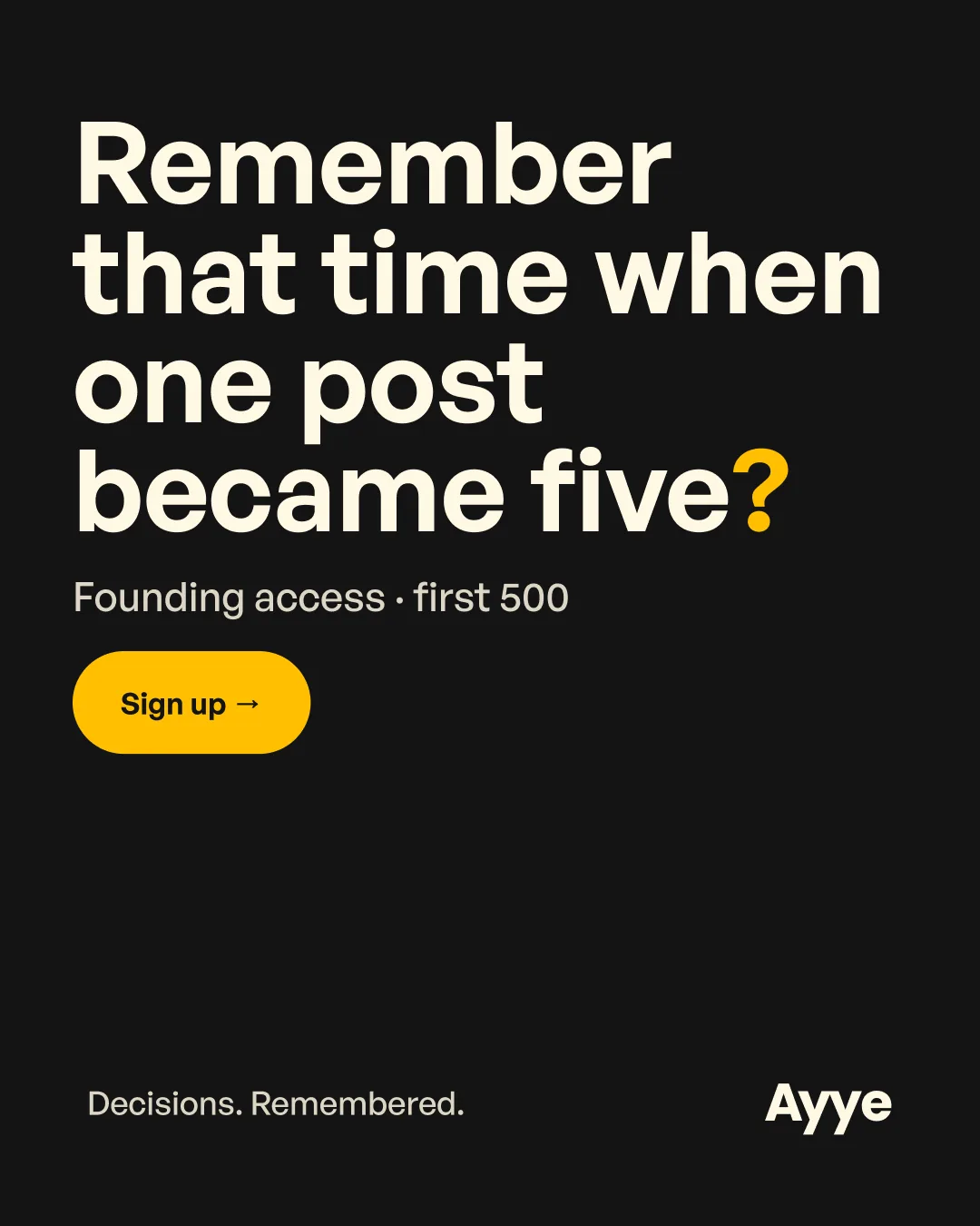
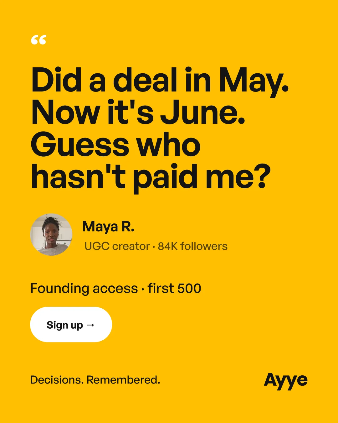
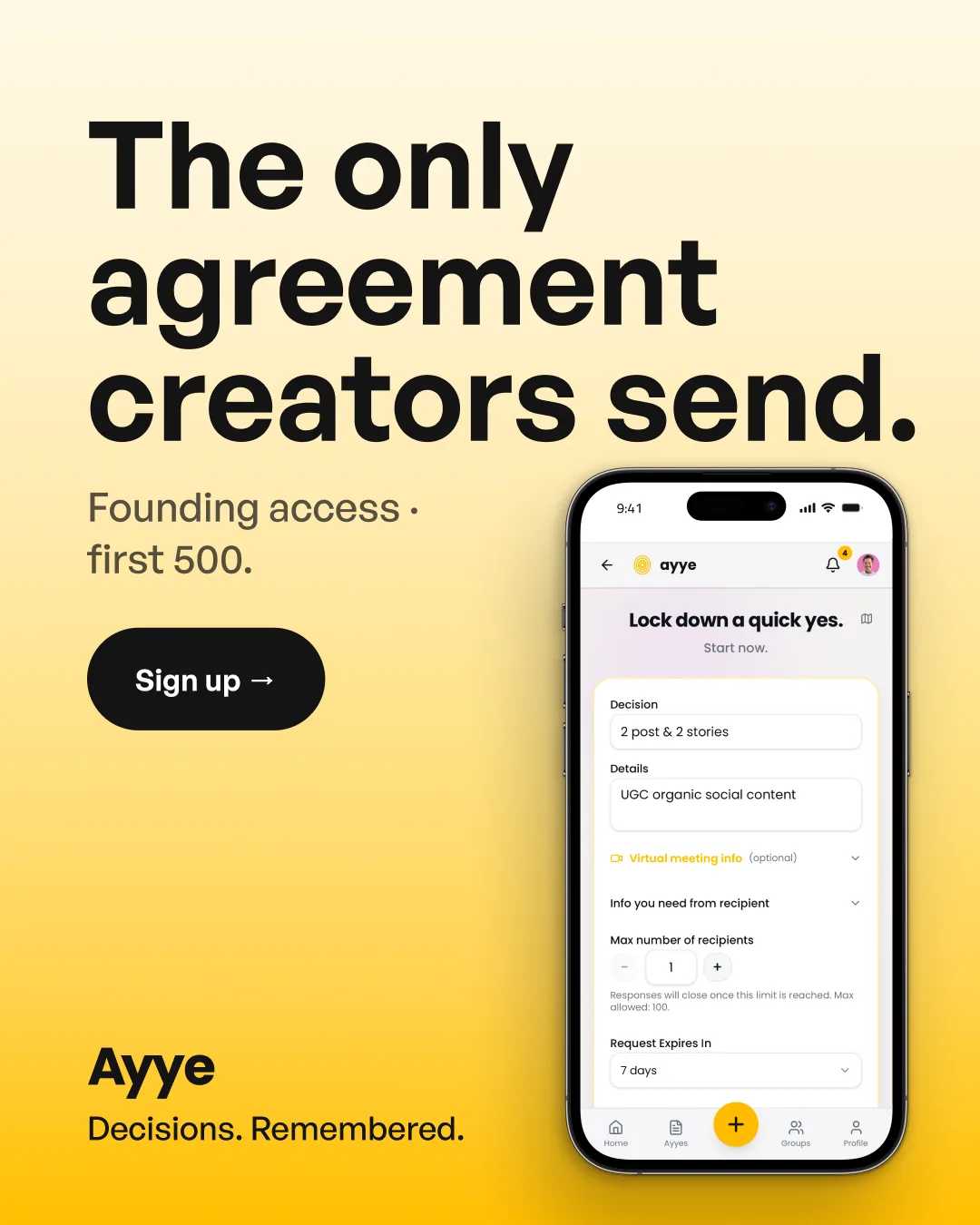
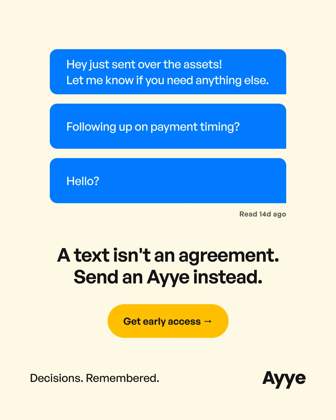
The Creators set. Four templates: the payment chase, the statement, the testimonial, the product shot.
Same template, two voices. The frame holds; the angle and the call to action retarget per audience.
Scripted in the Ayye voice.
Two UGC spots, one per audience, scripted dry in the Ayye voice.
One funnel,
built to convert.
The set is practically identical across audiences, so here is one: the creators page. Stop chasing. Start sending.
